React NativeExpoTypeScriptMobile App DevelopmentREST APIMobile UXCross-PlatformCase Study
Designing the Goldmines Picture App: A Cross-Platform Movie Experience
July 26, 20269 min read233 views0 comments
How I translated a movie discovery website into a focused React Native mobile experience with reusable screens, REST APIs, caching, watchlists, and responsive performance.
Designing the Goldmines Picture App: A Cross-Platform Movie Experience
Turning Goldmines Picture into a mobile app required more than placing the website inside a smaller frame. Mobile users browse with different constraints: limited screen space, touch interaction, variable networks, shorter sessions, and an expectation that navigation should always feel close.
This case study explains how I approached the cross-platform app, from information architecture and reusable React Native screens to REST API integration, caching, image performance, loading states, and consistency with the website.
Starting with mobile intent
The website supports broad catalogue exploration, but the mobile experience needs to help a user make progress with fewer visible controls. I began by prioritizing the most common actions:
See a featured movie or series
Browse the latest catalogue
Search for a known title
Open a focused detail page
Save something to a watchlist
Move between movies, series, watchlist, and profile
These actions shaped the app's main navigation and screen hierarchy. Less frequent options remain available, but they do not compete with the primary browsing flow.
Translating the brand to a native interface
The website's near-black background and warm gold accent were important parts of the product identity, so the app retains them. The translation focused on native interaction rather than exact visual duplication.
Hover behavior becomes visible buttons and press feedback.
Dense metadata becomes concise groups on the detail screen.
Desktop search becomes a dedicated, reachable mobile flow.
Large hero artwork is cropped around phone-safe focal areas.
The result feels connected to the web platform while respecting the way people hold and operate a phone.
Choosing a cross-platform architecture
React Native and Expo provide a productive foundation for sharing application logic across Android and iOS. TypeScript adds useful guarantees around navigation parameters, API responses, and reusable component props.
Tagged with
React NativeExpoTypeScriptMobile App DevelopmentREST APIMobile UXCross-PlatformCase Study
Comments
Leave a comment
The app is organized around:
Screen-level components for discovery, search, details, and watchlists
Shared visual components for cards, chips, ratings, and buttons
A navigation layer that keeps route names and parameters typed
An API layer responsible for catalogue requests
Server-state caching for repeated data
Media helpers that normalize remote image URLs
Separating these concerns makes the app easier to maintain. Screens describe what the user sees, while the API and caching layers handle how data arrives.
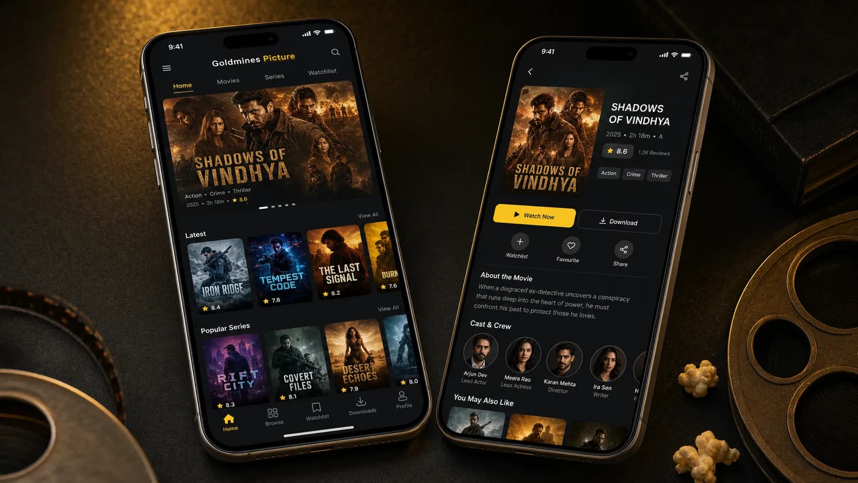
Designing the home discovery screen
The home screen needs to provide value before the user types anything. I structured it around a small number of clear sections:
A featured title with strong artwork and essential metadata
Latest movies for timely discovery
Popular or recommended series
Continue-browsing or saved content where appropriate
Direct access to broader category exploration
Each card presents only what is required for a quick decision. Full synopses and cast information belong on the detail screen. This protects the home screen from becoming visually heavy.
Horizontal lists work well for mobile entertainment content, but they should not hide their direction. Partial next cards, consistent spacing, and section actions help communicate that the row can be explored.
Building focused movie detail screens
The detail screen answers the questions a user has after selecting a title:
What is it?
What type of content is it?
How long is it?
What is its rating?
What is the story?
Who is involved?
Can I save or continue?
What similar content is available?
The screen leads with artwork and a concise metadata group, then presents primary actions, synopsis, cast, and related titles. Watchlist and favourite actions are visible without overwhelming the main action.
Long content remains scrollable, but the top portion gives enough information for a decision without requiring extra navigation.
Sharing data with the website
The app uses the same catalogue source as the web product through REST APIs. Shared data provides several operational benefits:
A title can be maintained through one content workflow.
Website and app metadata remain consistent.
Fixes to catalogue data benefit both clients.
New content becomes available without a mobile release.
The clients do not need identical response usage. List screens request compact summaries, while detail screens request richer records. This keeps mobile data transfer focused and reduces unnecessary parsing.
Server-state caching and network behavior
Mobile networks change frequently. A user may move between Wi-Fi and cellular data or temporarily lose connectivity. The interface should not appear broken whenever a request takes longer than expected.
Server-state caching helps in several ways:
Previously loaded lists can appear quickly on return visits.
Duplicate requests are reduced.
Background refresh can update stale data without clearing the screen.
Loading and error states remain associated with the request that owns them.
Caching does not mean showing old data forever. Each catalogue area can use a freshness policy suited to its content. Newly published sections may refresh more often than stable reference information.
Image performance on mobile
Movie applications are image-heavy, and uncontrolled images quickly affect memory, bandwidth, and list performance. I treated image behavior as part of the component contract.
Important practices include:
Requesting images appropriate to the displayed size
Using predictable poster and backdrop aspect ratios
Avoiding full-resolution artwork in small cards
Rendering placeholders while images arrive
Reusing cached remote images where supported
Limiting expensive effects inside long lists
Stable dimensions also prevent content from moving as images load, which makes scrolling feel more controlled.
Efficient list rendering
Large catalogues should use virtualized lists rather than rendering every card at once. The app keeps item components focused, provides stable keys, and avoids unnecessary work during scrolling.
I also keep callbacks and derived values under control where they affect frequently rendered rows. Optimization is based on observed interaction paths rather than adding complexity to every component preemptively.
The objective is a simple one: scrolling and navigating should remain responsive as catalogue size increases.
Loading, empty, and error states
Every data-driven screen needs more than a success layout.
The app includes:
Skeleton or progress feedback for initial loading
Refresh behavior for catalogue lists
Clear empty states for search and watchlists
Retry actions for recoverable network failures
Image fallbacks that preserve layout
An empty watchlist should invite discovery. An empty search should suggest changing the query. An error should provide a next action instead of displaying a technical message.
These states are small pieces of interface work with a large effect on perceived quality.
Touch targets and accessibility
Mobile usability depends on physical interaction. Important controls need generous touch targets, visible press feedback, and enough spacing to prevent accidental actions.
Text contrast, scalable labels, logical focus order, and meaningful accessibility labels make the interface easier to understand. Icons should support a label or established pattern rather than carry all meaning alone.
The gold accent is used selectively so it remains a useful indicator of active navigation and primary actions.
Keeping web and mobile consistent
Consistency does not mean identical screens. It means shared product concepts:
The same title names and metadata
The same visual identity
The same meaning for ratings and categories
Predictable watchlist behavior
Familiar discovery groupings
Web and mobile can then use platform-specific navigation while presenting one coherent service.
Testing the important paths
For a discovery app, I prioritize complete user journeys over isolated screens:
Open the app and load featured content.
Browse a list and open a title.
Save the title to a watchlist.
Return through navigation and confirm the saved state.
Search for a title and handle both result and no-result cases.
Retry after a simulated request failure.
I also test at different screen sizes and with slower network conditions. A layout that works on one large device is not enough for a cross-platform release.
What this project demonstrates
The Goldmines Picture App demonstrates mobile product work across:
React Native and Expo architecture
Typed navigation and API models
Cross-platform component design
Mobile information hierarchy
REST API integration
Server-state caching
Image and list performance
Loading, empty, and failure states
Brand consistency across web and mobile
The main lesson was to preserve the product model while adapting the interaction model. Users should recognize Goldmines Picture immediately, but the app should still feel designed for a phone.
Frequently asked questions
Why choose React Native for this type of app?
React Native supports a shared TypeScript codebase across Android and iOS while still allowing platform-aware navigation, components, and performance work. It is well suited to API-driven catalogue products.
Can the app and website use the same REST API?
Yes. Shared APIs keep catalogue content consistent. Compact list endpoints and richer detail endpoints allow each client to request only what its current screen needs.
How do you improve movie app performance?
Focus on virtualized lists, correctly sized images, stable card dimensions, request caching, small API payloads, and avoiding unnecessary rendering inside frequently scrolling rows.
Should a mobile app copy the website layout?
No. It should preserve the brand and product concepts while adapting navigation, density, touch targets, and content hierarchy for mobile use.
Final thoughts
The Goldmines Picture App extends the platform without treating mobile as an afterthought. A shared catalogue and visual identity connect it to the website, while native navigation, focused screens, caching, and careful media handling make it suitable for everyday phone use.
For me, the project is a practical example of how full-stack and mobile decisions meet: API design affects screen performance, content structure affects navigation, and visual consistency affects whether two clients feel like one product.